
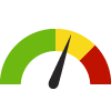
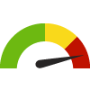
Indicator Gauge Icon Legend
Legend Colors
Red is bad, green is good, blue is not statistically different/neutral.
Compared to Distribution
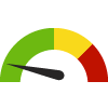 the value is in the best half of communities.
 the value is in the 2nd worst quarter of communities.
 the value is in the worst quarter of communities.
Compared to Target
 meets target;
  does not meet target.
Compared to a Single Value
 lower than the comparison value;
 higher than the comparison value;
 not statistically different from comparison value.
Trend

 non-significant change over time;
 significant change over time;
  no change over time.
Compared to Prior Value
 higher than the previous measurement period;
 lower than the previous measurement period;
 no statistically different change from previous measurement period.
 Significantly better than the overall value
 Significantly worse than the overall value
 No significant difference with the overall value
 No data on significance available
COVID-19 Daily Average Incidence Rate
This indicator is archived and is no longer being updated. Click to learn more
This indicator shows the population-adjusted confirmed daily average new COVID-19 cases recorded in the preceding 7 days (for example, Jan 31 includes the average daily incidence rate between January 25 - January 31, 2020).
Numerator = daily average of confirmed new cases in preceding 7 days
Denominator = total population of the locale
Why is this important?
As a measure of incidence, incidence rate includes only new cases of disease in the numerator. The denominator is the number of persons in the population at the start of the observation period. In the outbreak setting, the term attack rate is often used as a synonym for risk. It is the risk of getting the disease during a specified period, such as the duration of an outbreak. By showing the daily average incidence rate per week, this approach helps prevent major events (such as a change in reporting methods) from skewing the data and better allows visualizations overtime.

cases per 100,000 population
| County | Source | Measurement Period | Cases per 100,000 population | |
|---|---|---|---|---|
There are 17 County values. The lowest value is 4.35, and the highest value is 18.15.
Half of the values are between 5.95 and 8.95.
The middle (median) value is 7.92.
Data Source
- Healthy Communities Institute
Maintained By: Conduent Healthy Communities Institute (Methodology)
Filed under: Health / Immunizations & Infectious Diseases, Health / Respiratory Diseases, Health Outcomes, Adults, Older Adults